S’well Rebrand
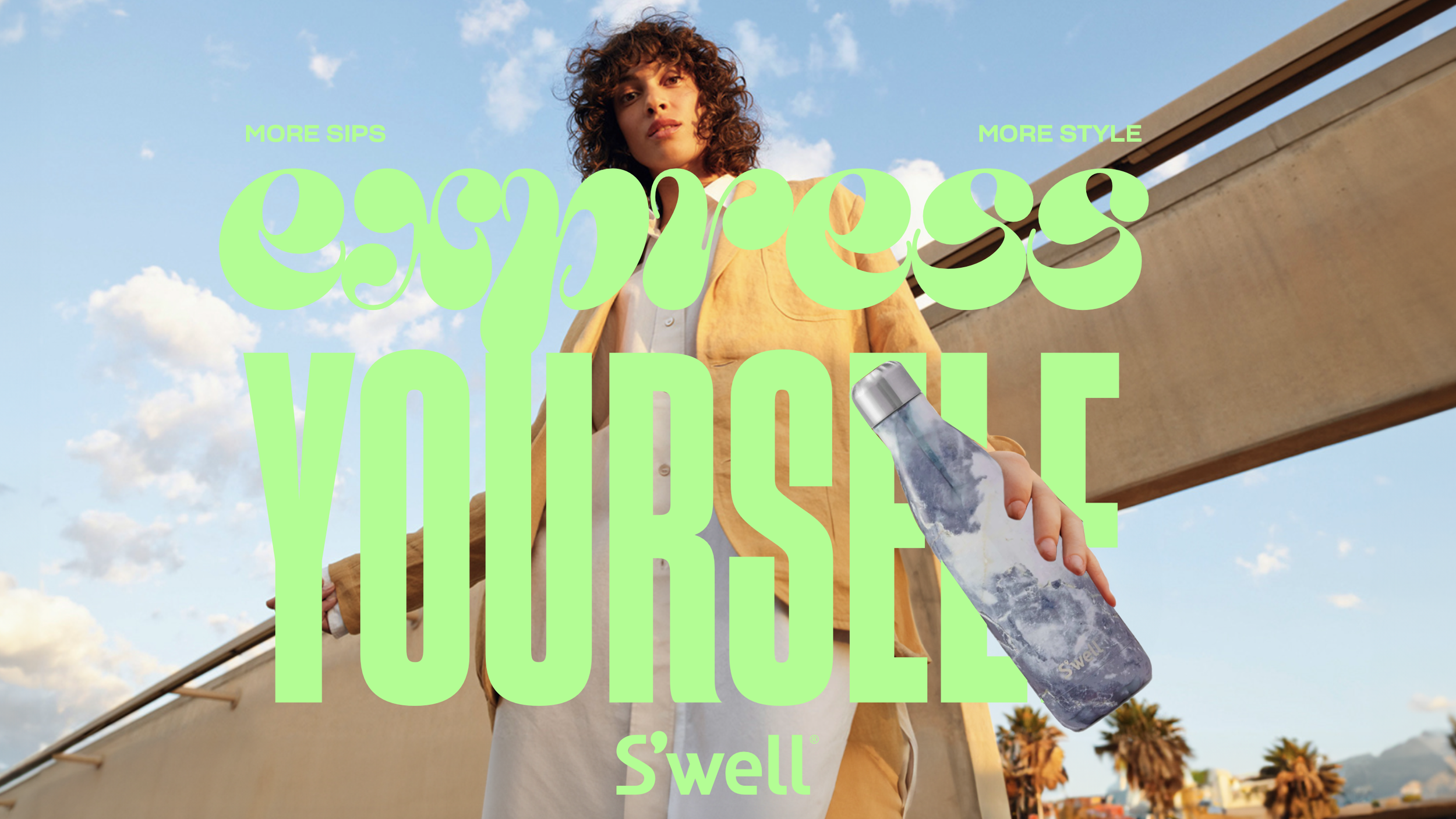
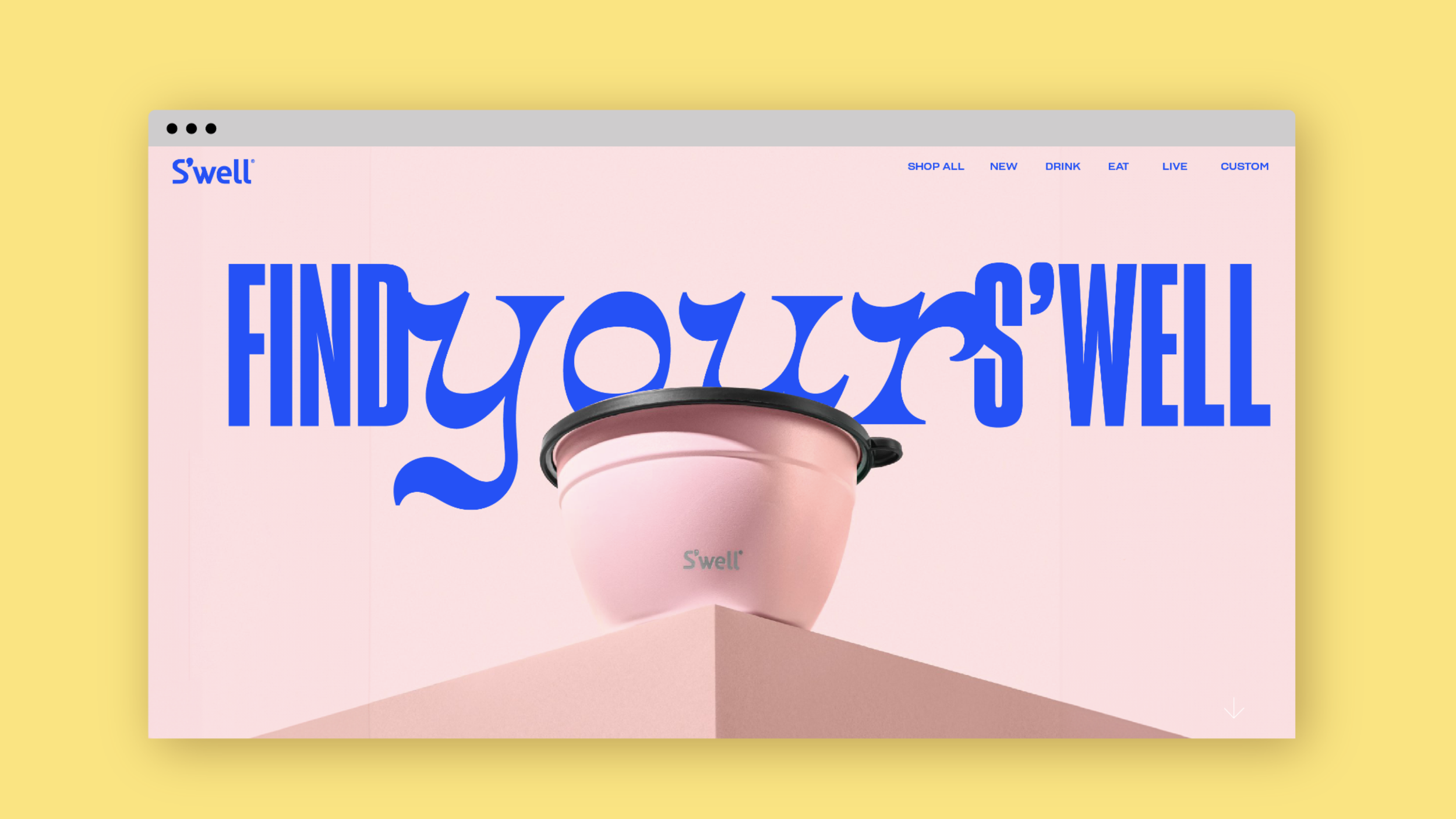
With changing market dynamics, S'well needed to develop an ownable positioning and a revitalized creative approach that would drive category distinction while connecting with an evolving target audience. This required comprehensive consumer insights to understand their core customers, inform a new audience strategy for brand growth, and establish updated guiding principles for future brand development. The refreshed visual system features a bright color palette and expressive typefaces that put consumers' personalities front and center, contrasting with competitors who rely on limited-time offerings to drive self-expression. Updated brand typography introduces more character and playfulness, adding depth and texture to verbal communications and campaign materials.
Credit: Pearlfisher
Creative Director: Matt Sia
Contribution: First round concept was picked to move into development